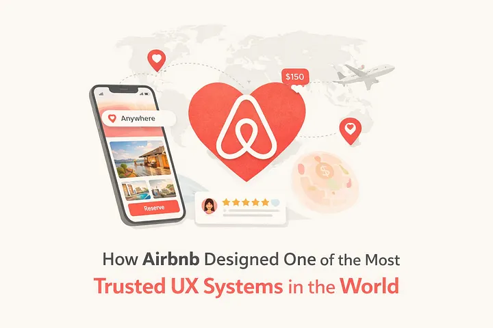
Airbnb is not just a booking platform. It is one of the most psychologically sophisticated trust-building UX systems ever designed.
With millions of listings across 220+ countries, Airbnb faced a challenge few platforms ever encounter:
How do you make someone feel safe sleeping in a stranger’s home?
This blog breaks down the UX strategy behind Airbnb’s mobile and web experience — from its coral color system to its double-blind reviews — and explains how every design decision reduces anxiety and increases trust.
The Core Philosophy: Design for Belonging
Airbnb doesn’t compete like traditional booking platforms. Hotels compete on price efficiency. Airbnb competes on emotional connection.
Its entire UX system is built around three psychological pillars:
- Belonging
- Trust
- Discovery
Every screen answers one silent user question: “Is this safe enough to book?”
If a feature doesn’t increase trust, it doesn’t stay.
The Three-Layer UX Architecture
Airbnb structures its experience across three cognitive layers:
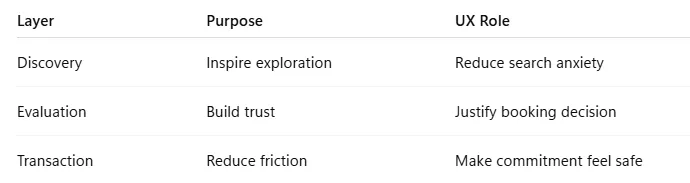
Instead of overwhelming users with booking forms immediately, Airbnb guides them through emotional readiness first.
1. Why Coral? The Psychology of Airbnb’s Color System
Airbnb’s primary brand color (#FF5A5F), known internally as Rausch, sits between red and orange — a deliberate psychological position.
What Coral Communicates
- Warmth (like a lit hearth)
- Approachability (softer than red)
- Optimism (travel emotion)
- Human connection
- Memorability (in a sea of blue apps)
Most competitors like Booking.com and Expedia use blue — signaling corporate reliability.
Airbnb intentionally avoided blue because:
Blue says “This transaction is safe.” Coral says “This experience will be warm.”
That difference defines the brand.
Even more strategically — coral is used only for forward-moving actions (Search, Reserve, Confirm). Never for destructive actions. That preserves urgency and meaning.
2. The Search Bar That Changed Travel UX
Airbnb’s pill-shaped search bar is not an aesthetic decoration.
It is psychology.
Why a Full Pill Shape?
- Sharp rectangle = formal, corporate, transactional
- Mild rounded corners = modern but generic
- Full pill = friendly, conversational, inviting
The pill shape signals: “Explore.” Not: “Fill out this form.”
The Real Innovation: The Collapsed Search
Traditional hotel apps show 3–4 fields immediately:
- Destination
- Check-in
- Check-out
- Guests
Airbnb compresses them into one tappable surface.
This is Progressive Disclosure in action.
Users see one action: Tap to start.
No paralysis. No complexity upfront.
“Anywhere” — The Power of One Word
The placeholder text evolved from:
- “Enter a destination” (transactional)
- “Where are you going?” (conversational)
To: “Anywhere.”
That single word shifts users from task mode to dream mode.
It turns search into imagination.
3. Photography Is the Interface
In most apps, photos are decoration.
In Airbnb, photos are the decision engine.
Research showed listings with professional photography:
- Receive 40% more bookings
- Command 26% higher prices
So Airbnb redesigned its product around photography quality.
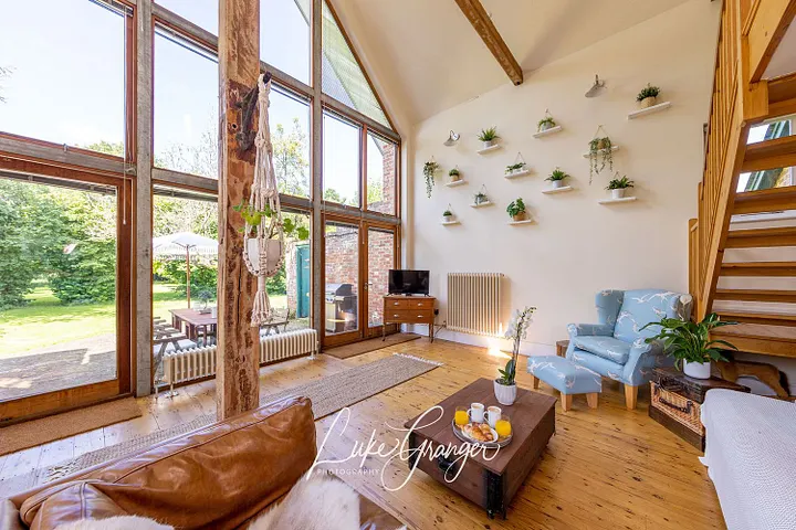
Why the 5-Photo Grid?
Desktop layout:
- 1 hero image (emotional desire)
- 4 supporting images (spatial validation)
It answers:
- Is it beautiful?
- Is it clean?
- Is it real?
- Is it worth the price?
The “Show all photos” button is deliberately subtle — reducing decision fatigue.
4. The Review System: Designing Radical Honesty
Airbnb’s entire business depends on credible reviews.
Unlike traditional platforms, Airbnb uses a double-blind review system:
- Guests cannot see the host review until both submit.
- The host cannot see guest reviews until both submit.
This removes retaliation bias.
Before this system, ratings inflated toward 4.8+ averages — making reviews meaningless.
After double-blind:
- Reviews became more honest
- Low-quality listings became identifiable
- Trust increased platform-wide
Six-Dimension Ratings
Instead of one vague star rating, Airbnb separates:
- Cleanliness
- Accuracy
- Check-in
- Communication
- Location
- Value
This solves ambiguity.
A 3-star overall rating tells you nothing. A 5-star cleanliness but 2-star accuracy tells you everything.
5. The Map: Price Where You Want to Be
Airbnb’s map doesn’t show pins.
It shows prices.
This collapses two cognitive steps:
- Find location
- Click to see price
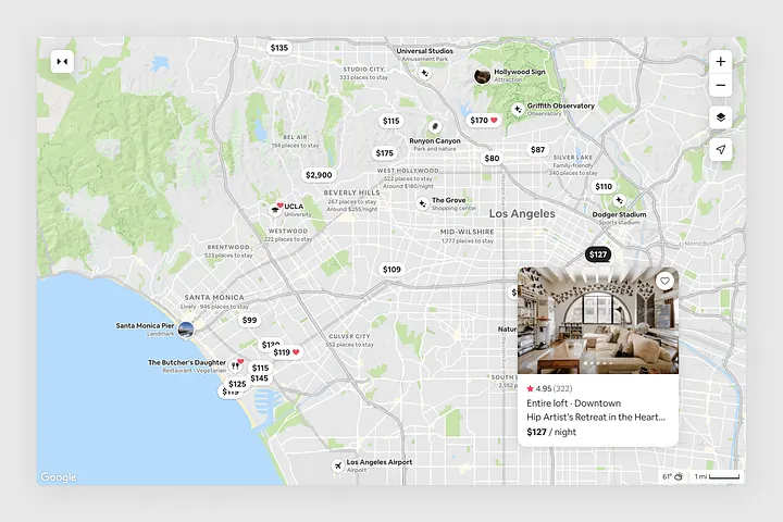
Now users scan neighborhoods and immediately understand:
- Affordable zones
- Premium zones
- Price distribution patterns
This reduces search friction dramatically in unfamiliar cities.
6. Micro-Interactions That Reinforce Emotion
Small animations carry emotional weight.
- Heart save icon fills with coral → reinforces affection.
- Photo swipe uses elastic resistance → mimics physical interaction.
- Skeleton loading screens → reduce perceived wait time by showing structure first.
These aren’t cosmetic choices.
They reduce anxiety during micro-moments.
7. UX Laws Airbnb Applies Brilliantly
Airbnb is a masterclass in applied cognitive psychology.
Hick’s Law
Fewer choices = faster decisions → Collapsed search bar → 5-photo limit → Curated categories
Fitts’s Law
Important actions are big and easy to tap → Full-width “Reserve” button → Large pill search bar
Law of Proximity
Related items grouped visually → Rating + price + reviews → Host photo + name + badge
Jakob’s Law
Follow familiar patterns unless improvement is strategic → Standard layout → Strategic innovation only where it adds value
8. AI as the Invisible UX Designer
Airbnb uses AI in subtle but powerful ways:
- Personalized search ranking
- Adaptive hero photos
- Contextual review surfacing
- AI-generated listing summaries
- Automatic photo reordering for hosts
The key principle:
The best personalization is invisible.
Users don’t notice personalization. They just feel like the results are “good.”
9. Where Airbnb Still Struggles
Even great UX has friction.
Total Price Transparency
Historically showing per-night price without fees damaged trust.
Review Recency
Old glowing reviews outweigh recent poor experiences.
Cognitive Load (Desktop Map)
Split-screen list + map requires working memory effort.
Good UX teams acknowledge weaknesses.
Great UX teams iterate on them.
The Real Lesson: UX as Trust Infrastructure
Airbnb’s success isn’t one clever feature.
It’s coherence.
Color says warmth. Photography says authenticity. Reviews say honesty. Host profiles say humanity. The map says transparency. The search bar says possibility.
Everything reinforces the same emotional promise: You belong here.
That is UX at scale.
Final Thought
Most travel apps optimize for booking conversion.
Airbnb optimized for psychological safety.
And when users feel safe — conversion follows.
Related Topics
Enjoyed this article?
Check out more blogs on our blog.