Every pixel has a reason. Here’s what’s really going on.
The Color Isn’t Just “Cool” — It’s Strategic
Uber chose black because it was originally positioning itself as everyone’s private driver. Black = luxury cars, executive transport, premium service. But the psychology goes deeper — black carries zero cultural baggage across 70+ countries. Red means danger in some cultures, green means money in others. Black just means premium, everywhere.
Competitors went pink (Lyft), green (Grab), orange (Ola). Uber went black. That wasn’t a mood — it was a market positioning statement.
The Search Bar Shape Has a Reason
That rounded rectangle isn’t random. Three shapes were on the table:
Sharp corners → feels like a government form. Too corporate. Full pill shape → feels like a social app. Too casual for a service involving money and safety. Rounded rectangle → approachable but structured. Friendly but serious.
Lyft uses the full pill shape deliberately — it signals fun. Uber uses the rounded rectangle — it signals reliable. Same category, opposite brand personalities expressed through one design decision.
The Search Bar Is Also Huge — On Purpose
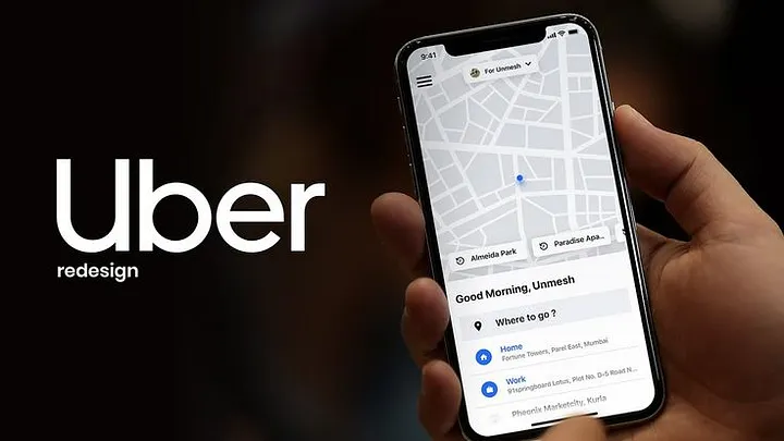
Fitts’s Law: the larger a tap target, the faster and more accurately you can hit it. Uber’s search bar is about 80–90% screen width, roughly 56px tall. It’s the biggest tappable thing on the home screen. This isn’t an aesthetic choice — it’s a conversion optimization. Every millisecond saved between opening the app and typing a destination reduces booking drop-off.
“Where to?” Is Genius Copywriting
Two words. One question. Notice what it isn’t:
Enter your destination Search for a location Destination address
“Where to?” is how a real driver would ask. It’s conversational, it humanizes the experience, and a question is psychologically easier to answer than a blank form field. Tiny copy decision, massive UX impact.
The Map Takes Up 70% of the Screen for 6 Reasons
Most people think it’s just a background. It’s not. The map simultaneously:
- Shows your exact location — kills pickup anxiety before it starts
- Displays nearby driver dots — social proof that cars are available
- Shows live movement — proves the system is working right now
- Sets wait time expectations before you even book
- Keeps you visually engaged during the few seconds you spend selecting a ride
- Lets you spot a wrong GPS pin and fix it before confirming
Hiding the map behind a UI panel would eliminate all six of these. Uber never does this.
The Bottom Sheet Is Smarter Than It Looks
When you pick a destination, a panel slides up from the bottom showing ride options — but the map stays visible. This is the bottom sheet pattern, and it solves a real UX problem: you need to make a pricing decision (which requires focus) while also maintaining spatial context (where am I going?). A full-screen modal would hide the map and force you to mentally reconstruct your journey. The bottom sheet lets both things coexist. Less cognitive load = fewer booking abandonments.
Surge Pricing UX Is Behavioral Economics in Action
Showing surge as 2.1x instead of +$8.40 is deliberate. Research in behavioral economics shows multipliers feel less painful than dollar amounts, even when they’re mathematically the same.
The “wait X minutes for lower prices” prompt is equally clever — it reframes surge from punishment into choice. Users with agency don’t rage-quit. Users who feel trapped do.
Color Is Only Used as a Signal
In Uber’s design system, color is never decoration. Green = driver found. Orange/red = surge pricing. Blue = your location. If something has color, it means something. If it doesn’t need to signal anything, it stays black, white, or gray.
This creates one of the most efficient visual languages in consumer apps. Your eye only travels to color when there’s information worth having.
The One Big Mistake
The hamburger menu. Hiding payment, activity history, and settings behind three horizontal lines was acceptable in 2013. In 2024, it’s an anti-pattern — it buries frequently needed features and fails discoverability. Uber keeps it because their home screen is so dominant that global navigation is rarely needed mid-flow. That’s a defensible reason. It’s still a compromise.
The takeaway: Uber’s app looks simple because enormous effort went into removing everything that wasn’t essential. The map, the search bar, the color system, the typography hierarchy — none of it is arbitrary. It’s a decade of A/B tests and behavioral research compressed into an interface that most users never consciously notice.
That invisibility is the point. And it’s the hardest thing to design.
Related Topics
Enjoyed this article?
Check out more blogs on our blog.