
Interfaces that convert. Components that scale with your product.
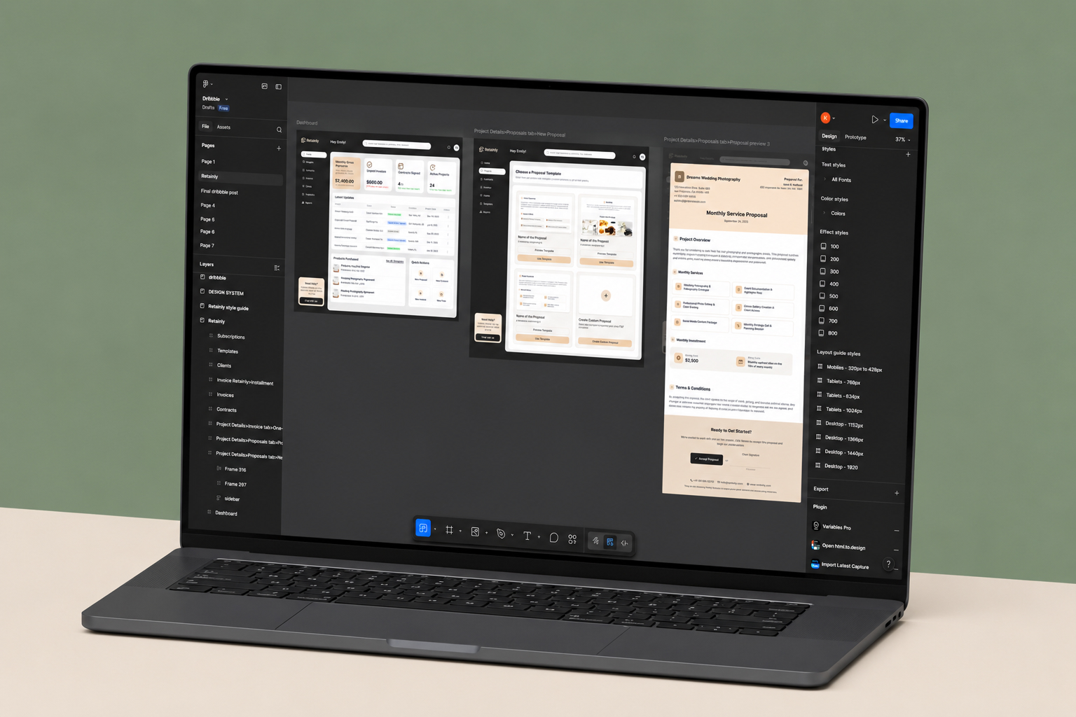
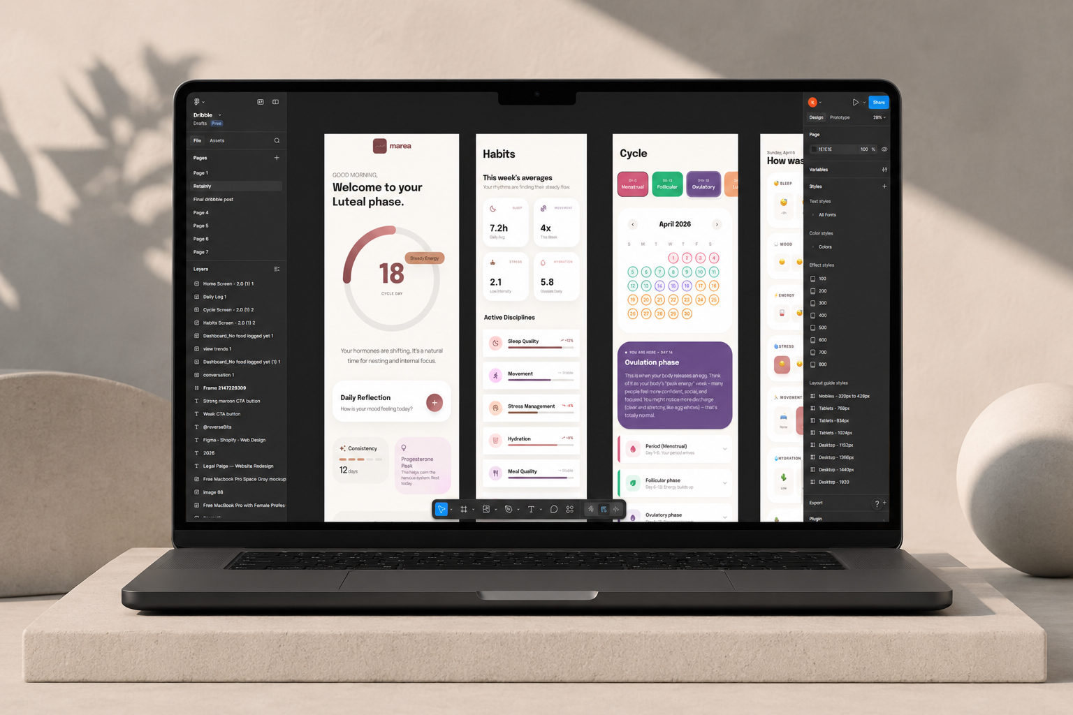
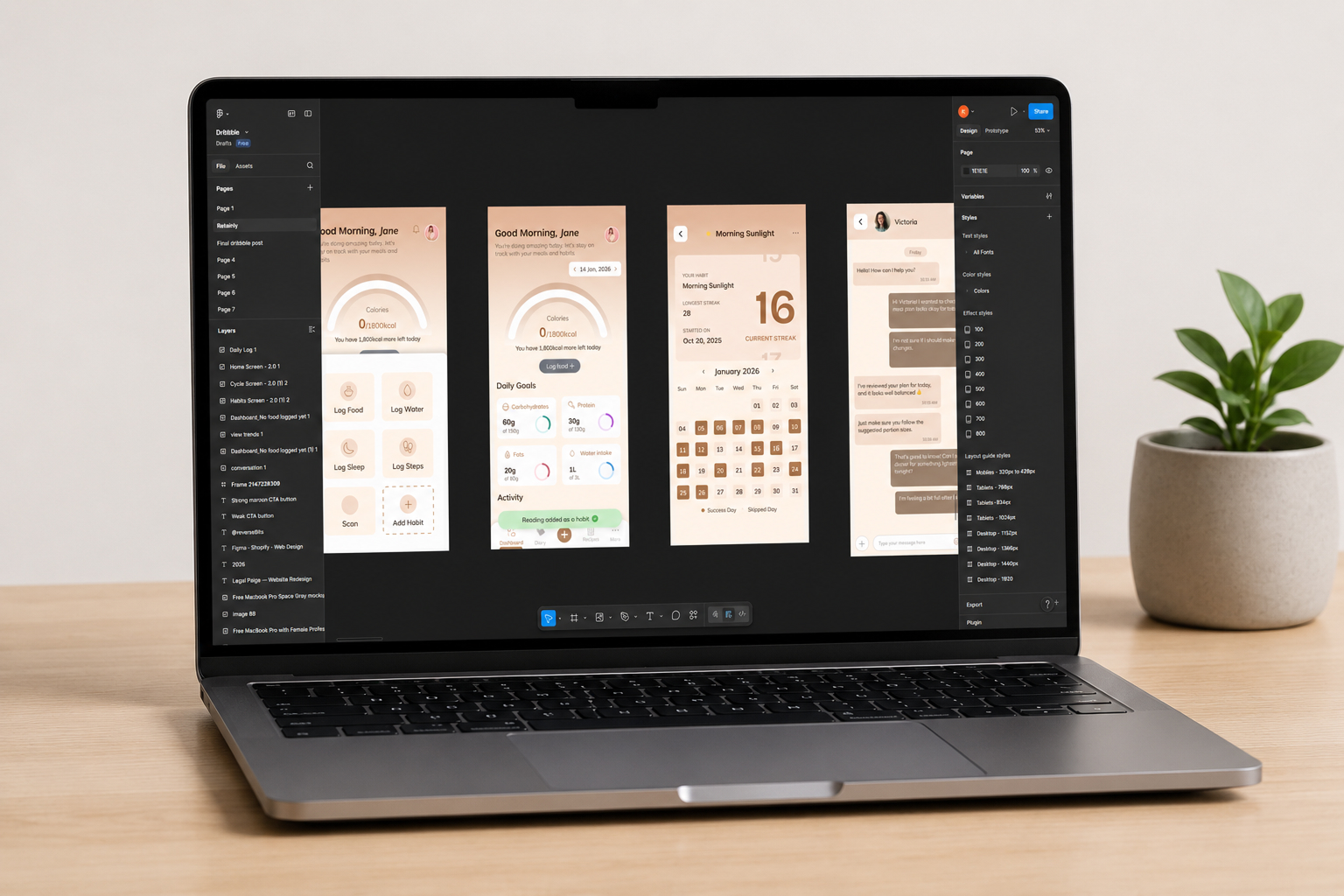
Production-grade UI architectures and design systems that carry your product from prototype to scale. Developer handoff with zero back-and-forth.

Figma powers design at


4M+
Monthly active designers on Figma
31%
Average conversion lift from UI redesigns
30%
Faster developer velocity with design systems
25%
Fewer iteration cycles with token architecture
Fit check
When does your app need a dedicated Figma specialist?
UI design is more than drawing screens. It's about engineering how your product variants behave across platforms and keeping developer alignment tight.
Figma Design is a strong fit if
GOOD FIT•
You are scaling an app and need a unified component system to move faster.
•
Your developers complain about missing or poorly exported design tokens.
•
You need high-fidelity prototyping before committing engineering hours.
•
Your platform spans Web, iOS, and Android and demands visual consistency.
Consider alternatives if
CHECK FIRST•
You are validating a 2-page prototype and visual accuracy doesn't matter yet.
•
You don't care if developers write hardcoded styling inside your app.
•
Your project is a graphic design or illustration-driven marketing site.
Outcomes
What expert Figma design actually delivers
We build design files that software engineers actually respect and use without friction.
Zero guessing during developer handoff
Every spacing value, color token, and component variant is documented directly in the file. Developers inspect, copy, and build — no Slack threads asking what margin was intended or which shade of grey that border is.
Dev teams that work faster, not harder
Token exports map directly to your CSS variables or theme config. Engineers pull values programmatically instead of translating visual specs by hand on every screen, cutting implementation time on each component.
Auto-layout that mirrors code box models
Every frame is built with explicit direction, gap, padding, and alignment — the same properties engineers set in flexbox and CSS Grid. No translation layer between the Figma file and your frontend.
Variable token architectures that scale
A single master token file governs colors, typography, and spacing across every screen. Brand refresh, dark mode, or white-label variant — one variable change propagates through the entire system instantly.
High-fidelity prototypes before any code
Test user flows with realistic interactive prototypes before committing engineering hours. Find the friction in Figma, not in your sprint backlog.
Design files you own and can maintain
No messy vector layers or unnamed groups. Clean, logically structured components your internal team can extend and update long after our engagement ends.
Capability Comparison
Figma specialist vs the alternatives
See the impact of working with dedicated design systems architects instead of general illustrators.
Dev handoff quality
Figma Design Specialist
Production tokens
Generalist Designer
Clashing logic
Development Agency
Basic UI export
In-house Junior
Messy layers
Component scalability
Figma Design Specialist
Full system sync
Generalist Designer
Limited to screens
Development Agency
Restricted hardcode
In-house Junior
Frequent breaks
Box-model replication
Figma Design Specialist
CSS-mirrored auto-layout
Generalist Designer
Arbitrary dragging
Development Agency
Basic functional grids
In-house Junior
Inconsistent padding
Variable architecture
Figma Design Specialist
Unified master file
Generalist Designer
Scattered styles
Development Agency
Developer-forced config
In-house Junior
No tokens used
Prototyping complexity
Figma Design Specialist
High-fidelity logic
Generalist Designer
Simple click-through
Development Agency
Rare / skipped
In-house Junior
Basic connections
Process
From brief to developer-ready in six steps
A standardized workflow built to make design-to-development integration smooth and predictable.
01
Discovery
Auditing core product logic, user journeys, edge cases, and business KPIs before drawing.
02
Wireframes
Building low-fidelity structures mapping content hierarchy and feature layouts.
03
Visual identity
Establishing the mood board, typography, color palettes, and brand direction.
04
Prototypes
Wiring realistic connections and animations simulating the final product experience.
05
Component library
Building the full auto-layout atomic variants matrix supporting all states.
06
Dev handoff
Exporting unified JSON tokens and finalizing developer inspection documents.
Specialists
The full Figma platform, used properly
We use every technical capability the modern Figma workspace offers, not just the surface.
01
Advanced design systems
Nested atomic component models — one change updates every screen without fragmenting individual layouts.
02
Strict variable architecture
Design token libraries for colors, typography, and spacing that map directly to CSS variables in your codebase.
03
Smart prototyping
Variable-driven logic states that simulate data entry flows and real application feedback inside Figma.
04
Branching and versioning
Figma branching workflows keep the main design file stable while exploration happens in parallel.
05
Plugin integration
Translation, accessibility testing, and code generation plugins wired into the workflow to cut repetitive formatting tasks.
06
CMS and export syncs
Systems built for automated style exporting into Webflow, Framer, or your internal developer repositories.
Figma Design stack we ship on
Tools we use on Figma Design engagements.

Figma

FigJam

Illustrator

Framer Motion

React

Lottie

Stitch

Claude Design
Figma Design projects we have shipped
Representative project patterns and outcomes.
Problem / Solution
Problems we solve in Figma Design builds
Common risks in Figma Design projects and how we handle them.
"The designs don't match our code spacing logic, the margins and paddings are totally arbitrary."
Pixel-perfect auto-layout components built on a strict 4pt or 8pt grid system.
"They didn't define any fixed text styles. I have to guess typography line height on every screen."
Declared design tokens for fonts, colors, and shadows exporting directly to JSON variables.
"There are no empty states, hover states, or loading placeholders considered for any of these components."
Full interactive variants mapped to all UI states: hover, active, focus, disabled, and loading.
Figma Design FAQ
Common questions about Figma Design projects.
Three layers. Primitives hold raw values: hex colors, pixel sizes. Semantic tokens assign meaning: primary-background, body-text-size. Component tokens get specific: button-padding, card-border-radius. Everything exports as JSON that maps to CSS custom properties or your framework's theme config. Your engineers never translate design specs by hand.
Ready for a design system that your developers love?
Tell us about your product and see how structured Figma work removes the friction between design and code.